Entre islas
Lo que nos une, también nos separa.
What brings us together also sets us apart.
Two islands,
one personal story.
Two islands that already meant something to me before this shirt existed.
Two years ago, my girlfriend and I visited Tenerife on our first holiday together. This year, Gran Canaria brought us back to the Canary Islands. This time it became a trip we will never forget: we got engaged on Gran Canaria.
And on 7 June we sat in the stands together for UD Las Palmas against Málaga in the play-offs.
A few thousand kilometres from home, but this place no longer feels that far away.
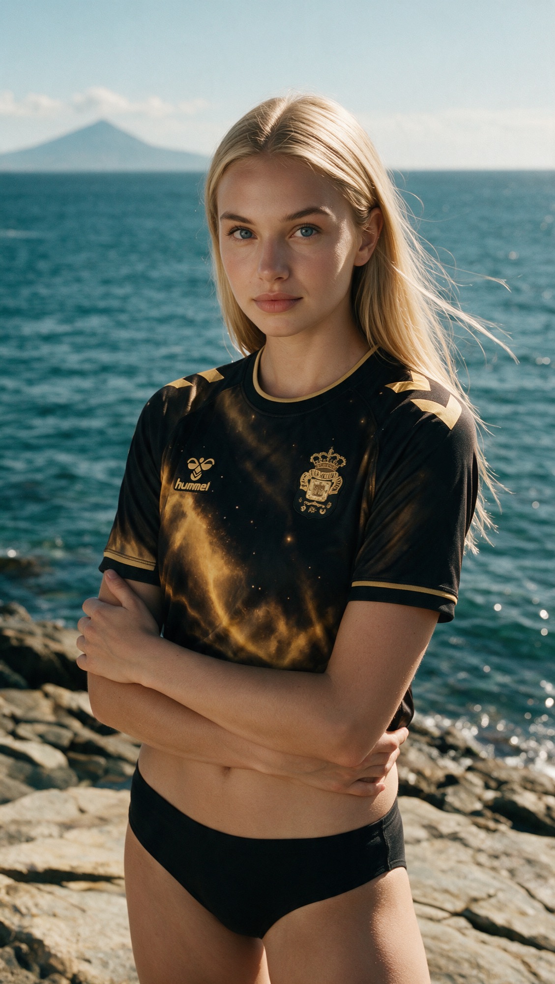
I didn’t want to start with how the shirt should look.
I wanted to know first why it should look that way.
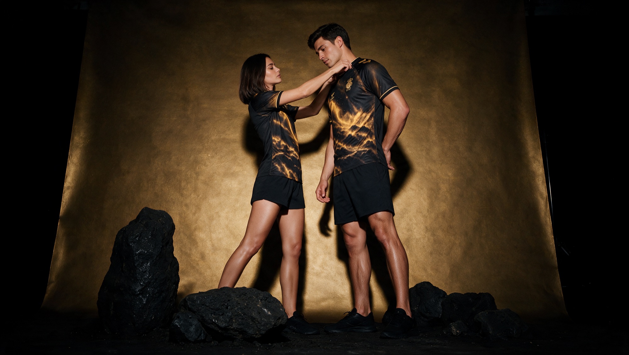
One archipelago.
Two identities.
Gran Canaria and Tenerife are rivals. But precisely because they are two Canary Islands, they share an enormous amount.
The same stars. The same calima. The same Atlantic Ocean. The same volcanic origin.
The elements that connect the islands are, at the same time, part of two different identities. That tension became the starting point of the shirt.
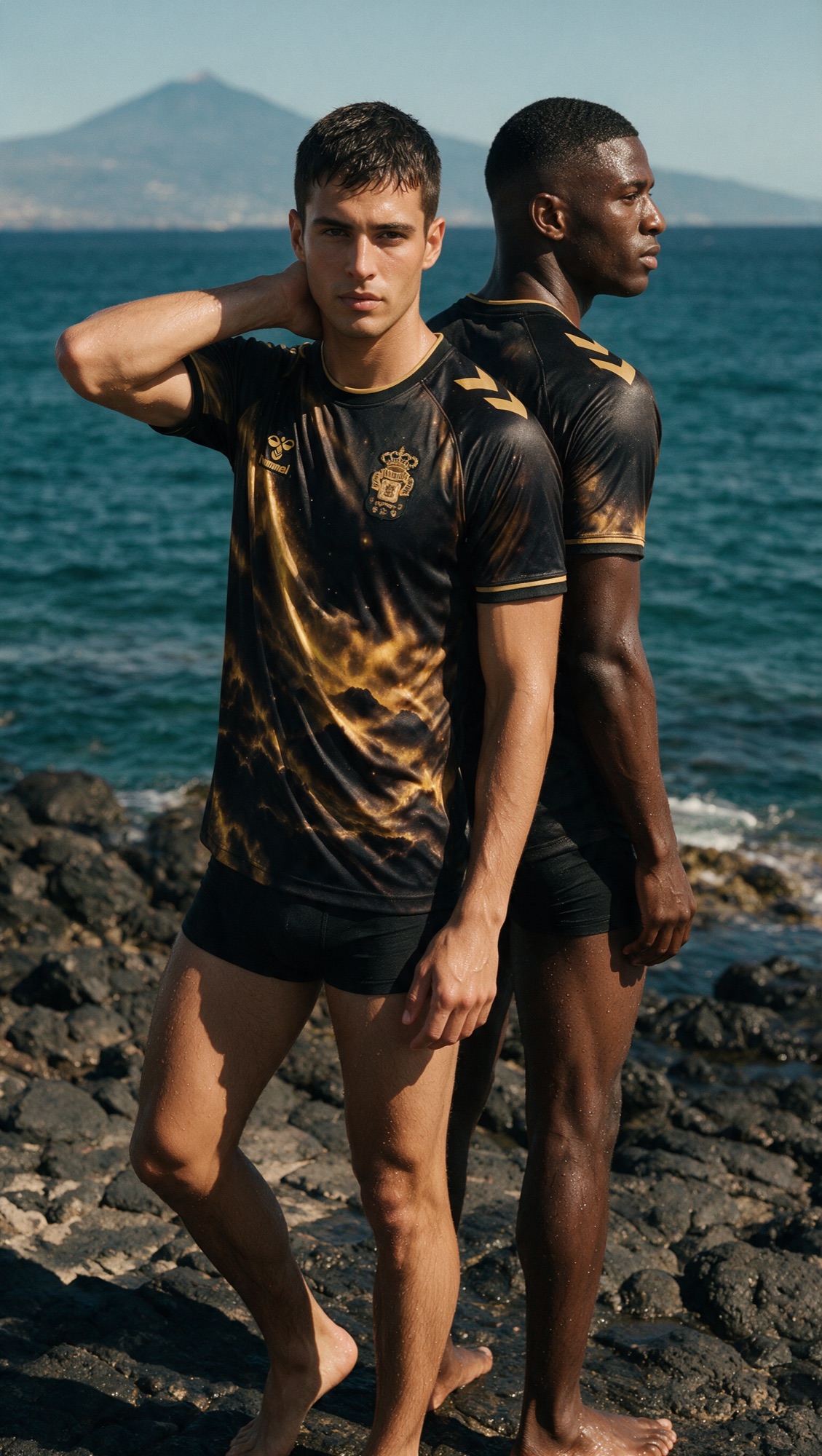
The calima sits at the heart of the shirt.
Saharan dust travels thousands of kilometres across the Atlantic Ocean before settling over the Canary Islands. It changes the sky. It changes the light. It changes the landscape.
That movement has been translated into a pattern of sand, copper, gold, black and smoke-like structures. From a distance it forms a whole. Up close, different layers appear.
- 01
Sky
The starry sky connects both islands.
- 02
Land
The earth is their origin.
- 03
Sea
The sea connects the islands and, at the same time, keeps them apart.
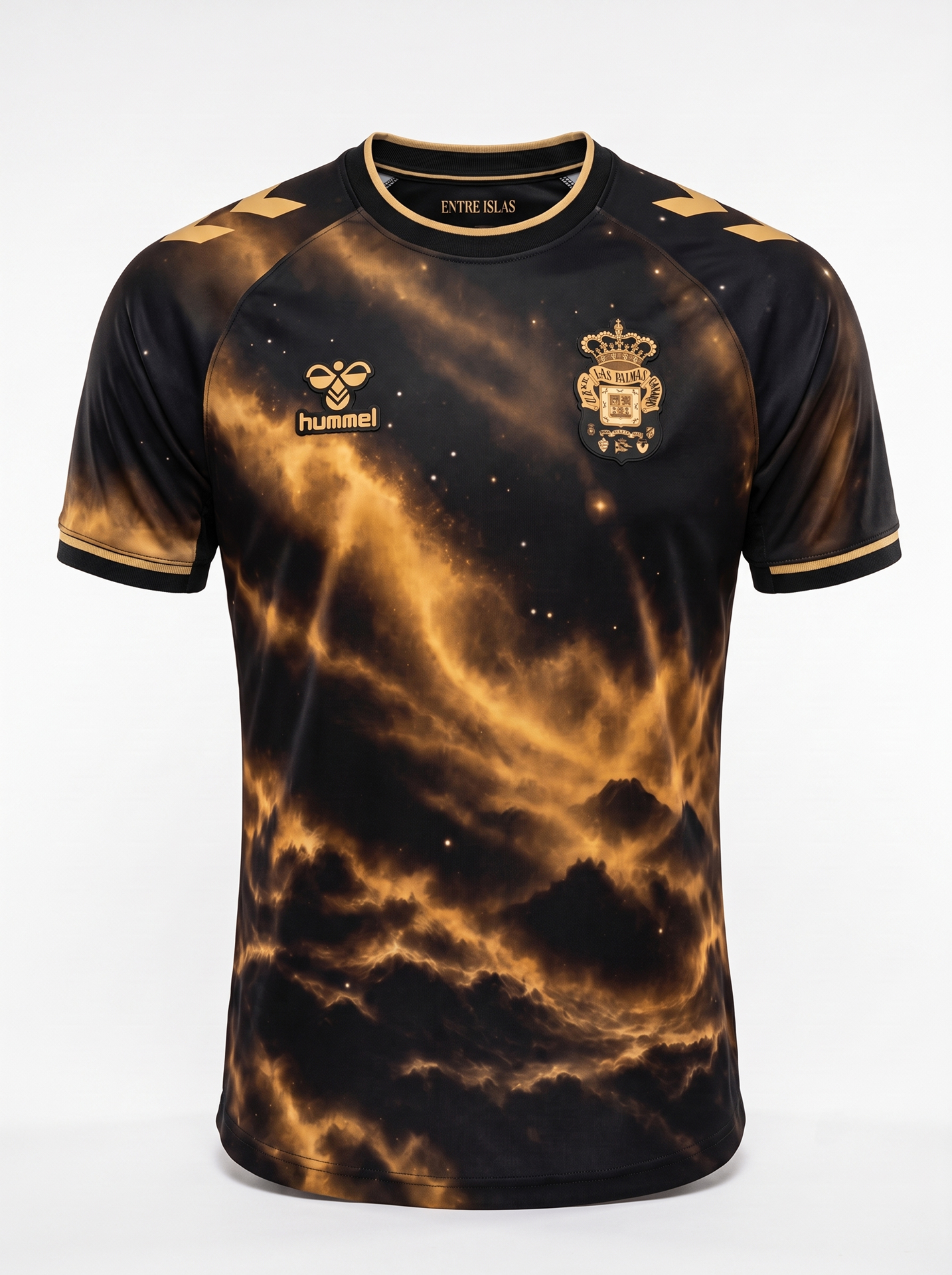
Built from
the islands.
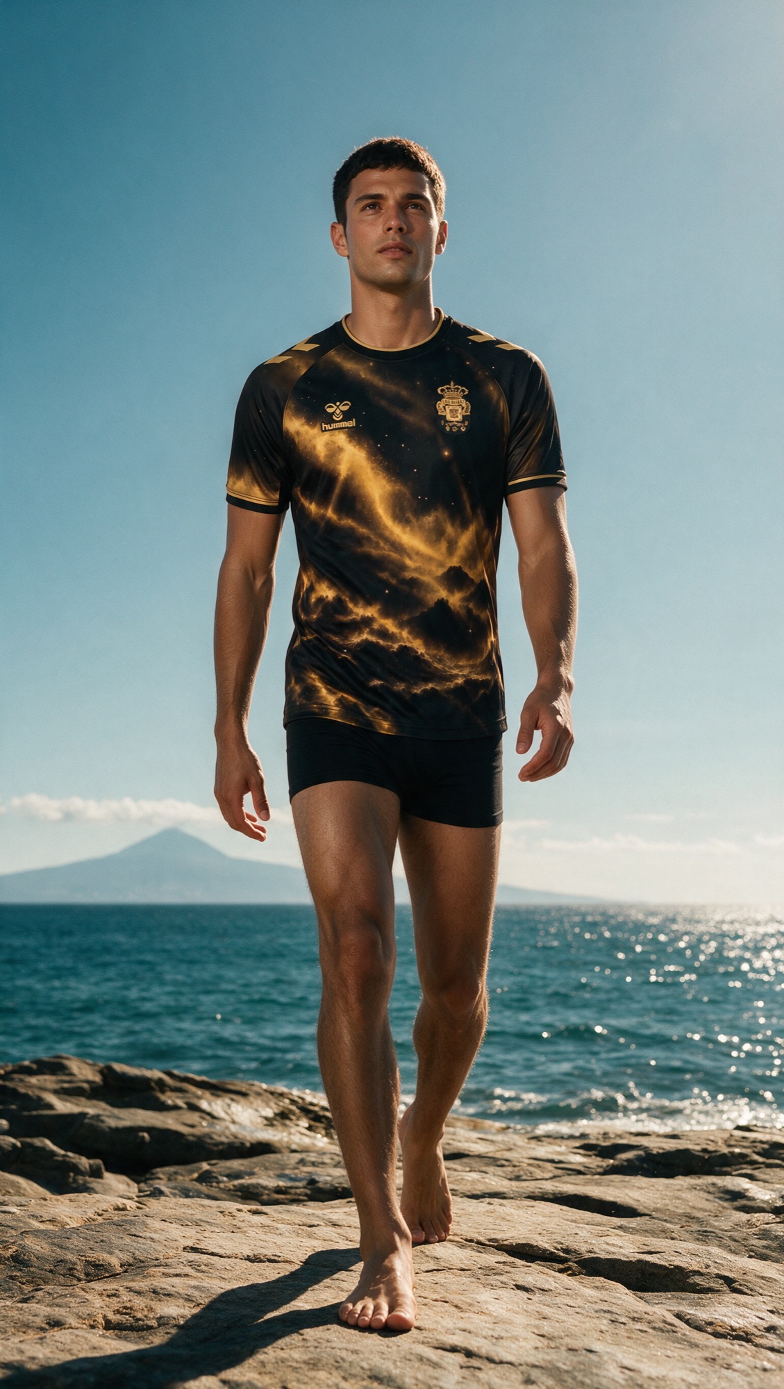
Black as the base, gold as the light. The pattern runs across the whole shirt without interruption: crest, branding and chevrons share the same gold tone, so they become part of the image rather than sit on top of it.
- 01Round rib collar with gold trim
- 02Two gold Hummel chevrons per shoulder
- 03All-over calima artwork
- 04Mono-gold crest and branding
- 05Inner-neck mark: Entre islas
- 06Black cuffs with gold line
- Black#0B0A09
Night, volcanic rock and contrast.
- Sand#D7C4A0
The calima and the journey of the Saharan dust.
- Bronze and gold#D2A458
The warm light when the calima crosses the islands.
- Stars#F1EEE8
A shared sky above both islands.
- Ocean#211A14
The connection and the physical distance between the islands.
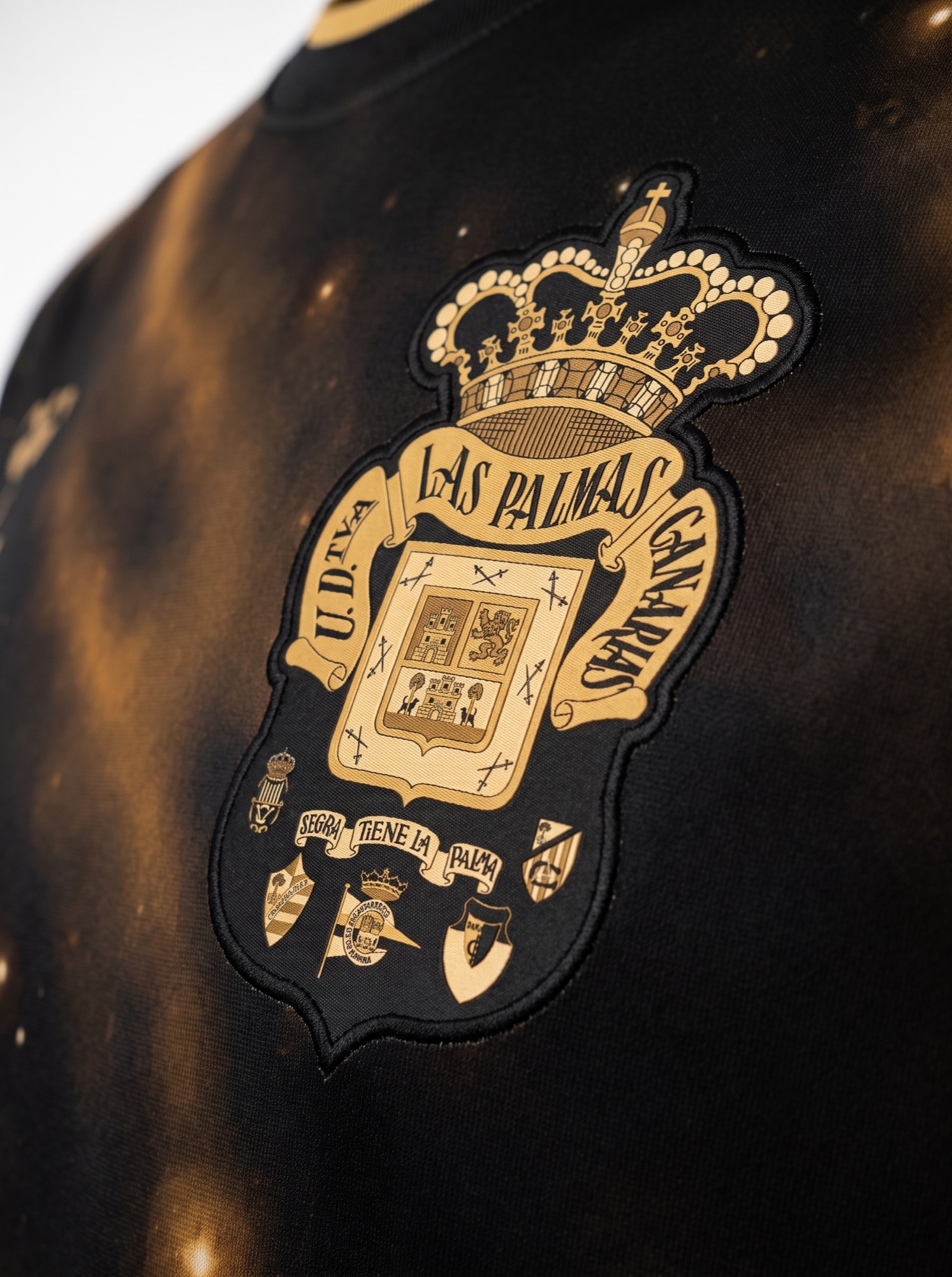
Rendered in one restrained gold, so it becomes part of the shirt rather than sitting on top of it.
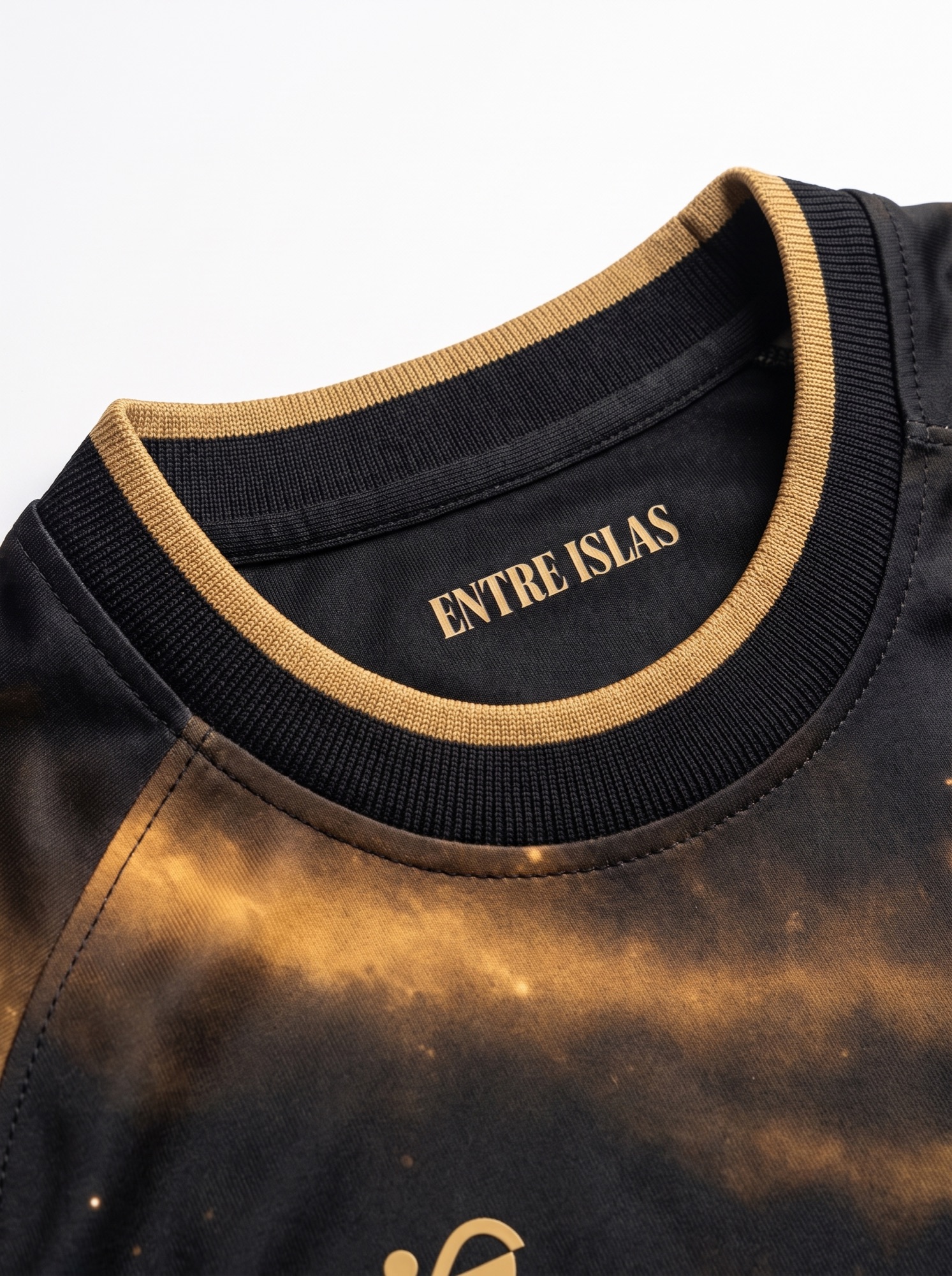
A clean round collar with a gold trim keeps the silhouette contemporary; the pattern stays the focal point.
The campaign may be emotional. The shirt still has to work as a football shirt.
A shirt becomes real
when it leaves the screen.
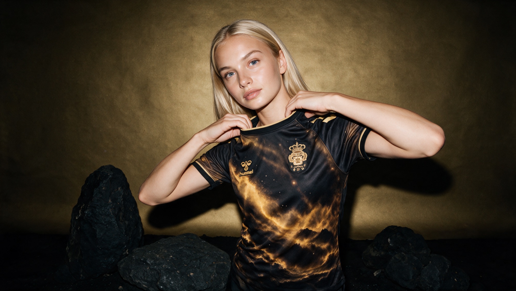
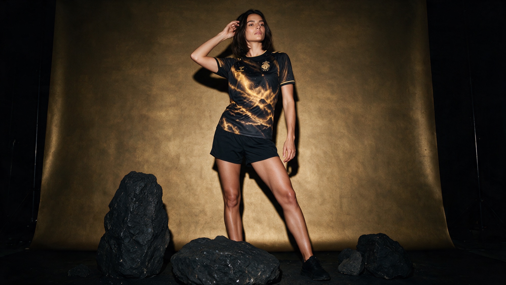
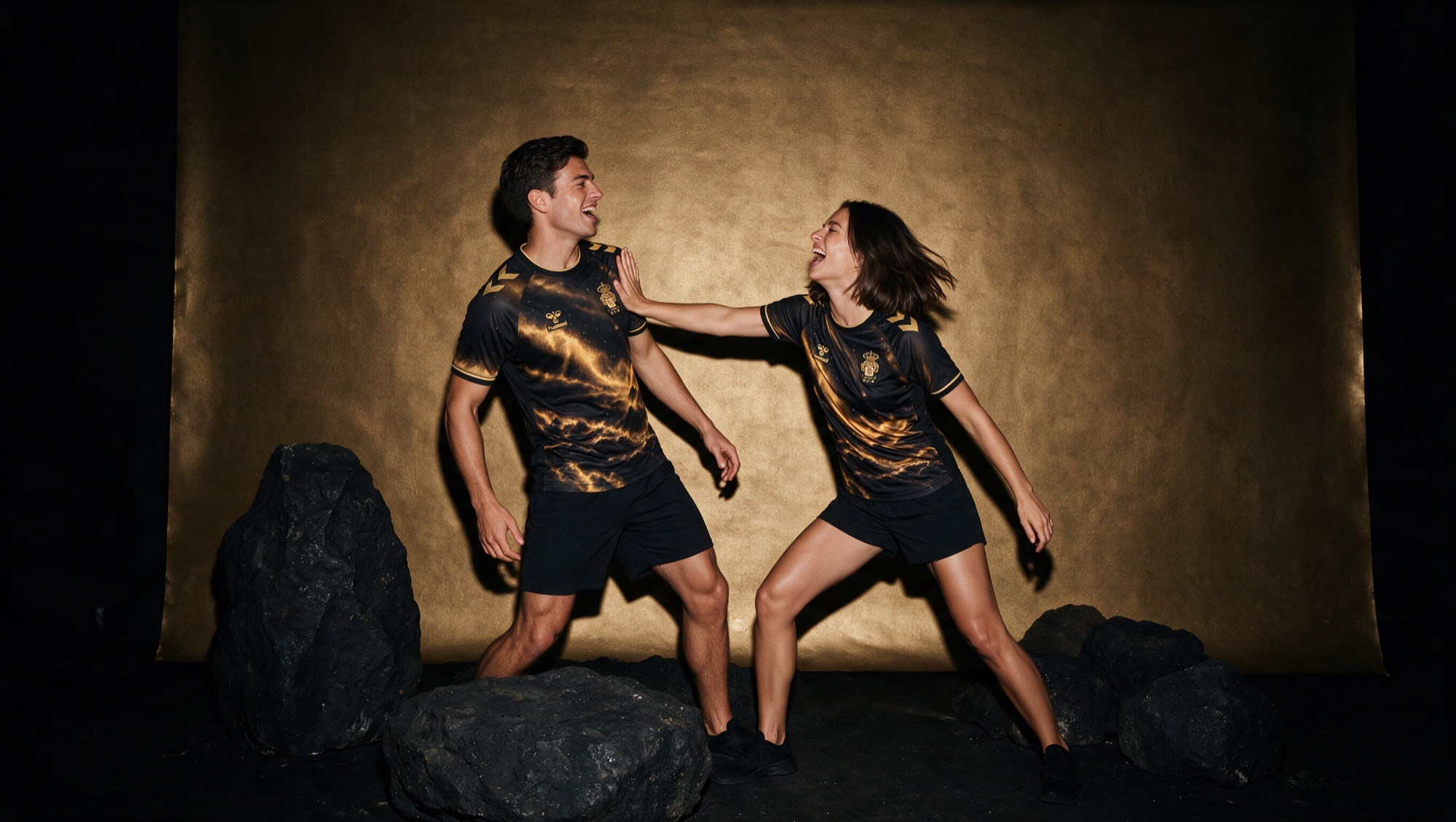
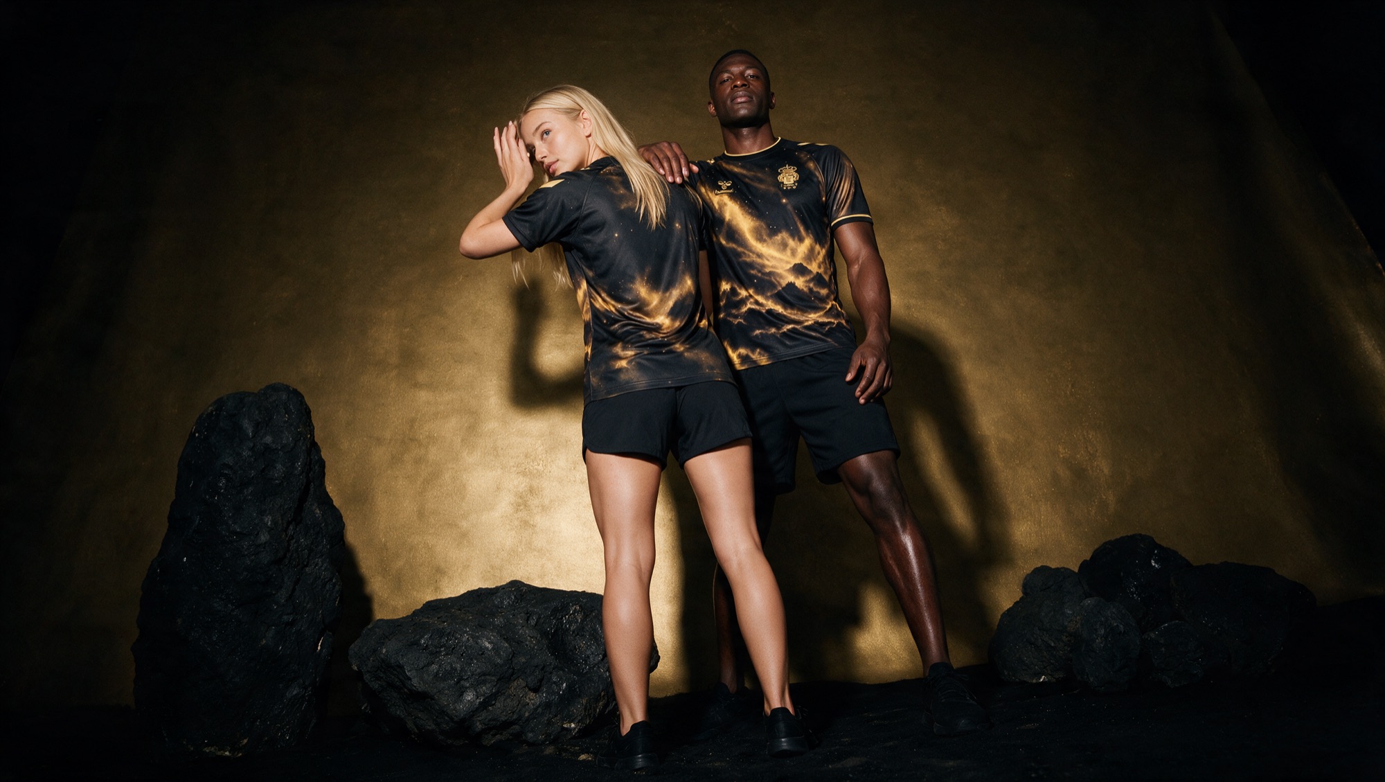
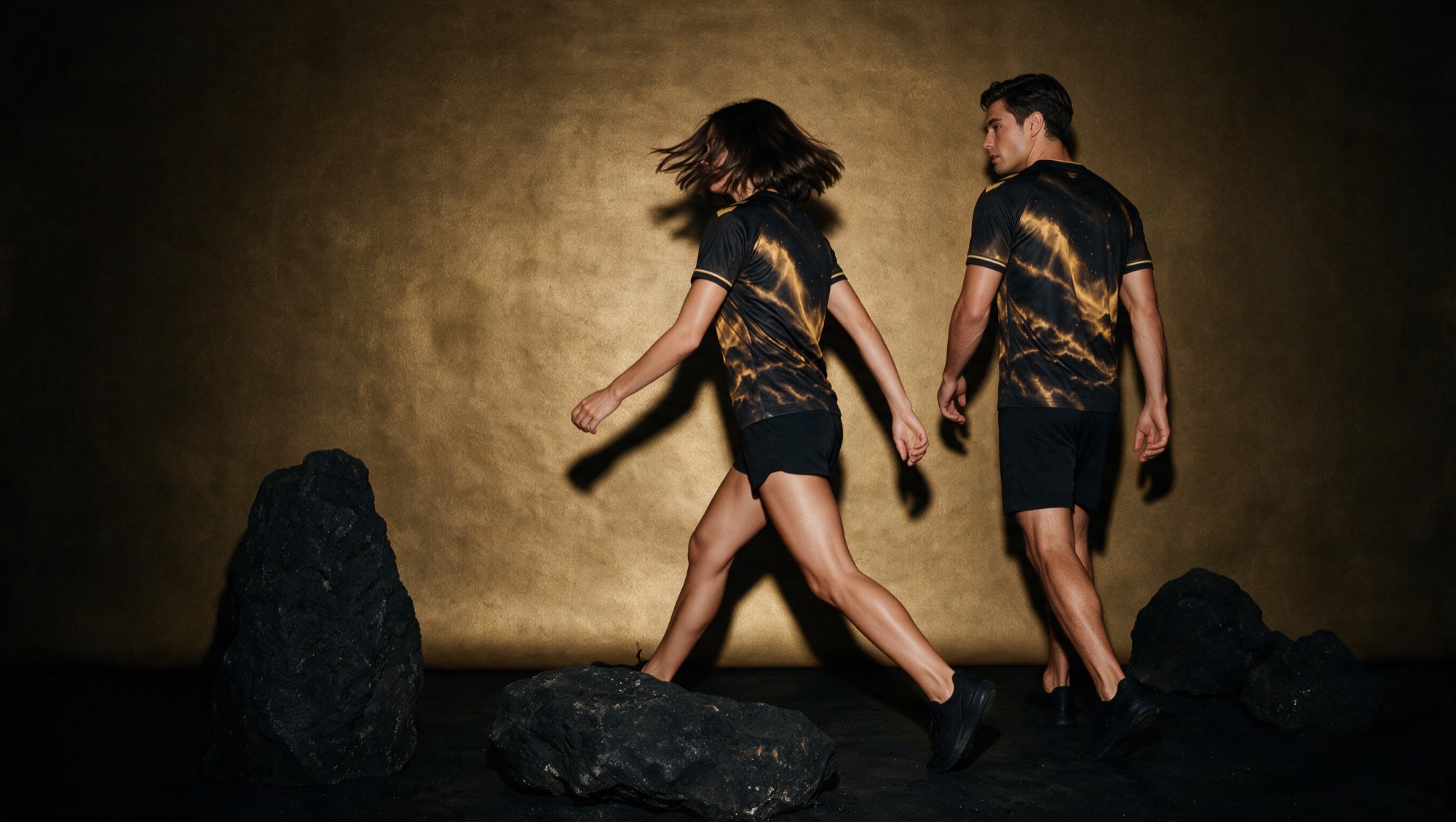
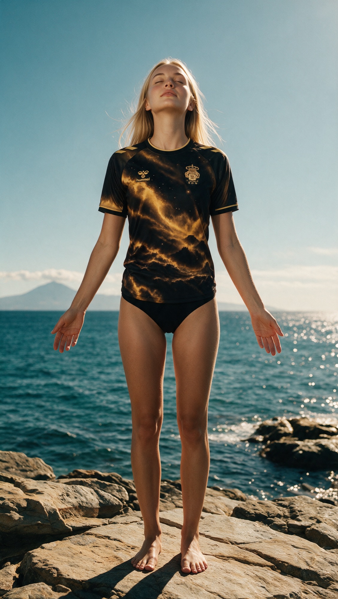
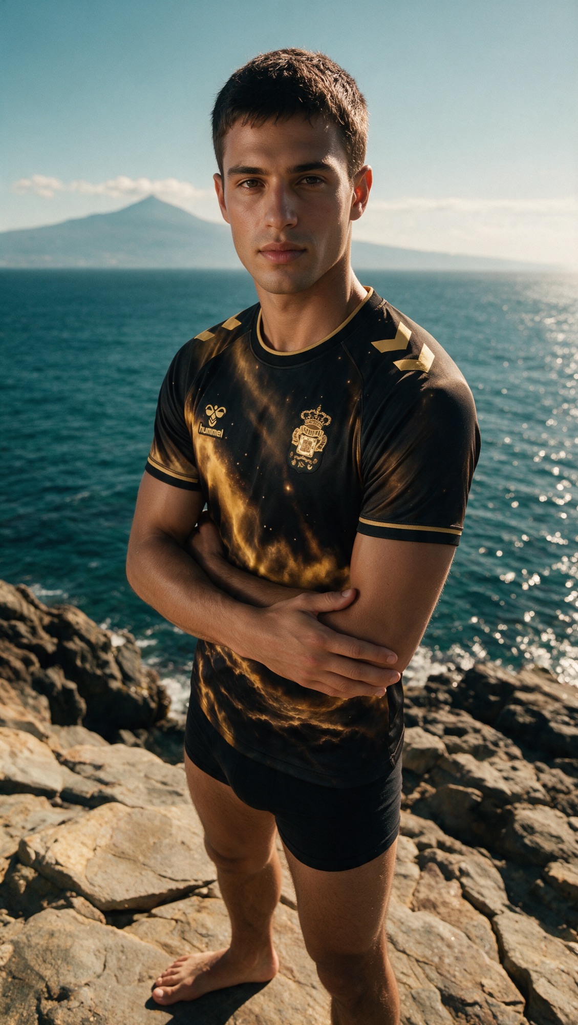
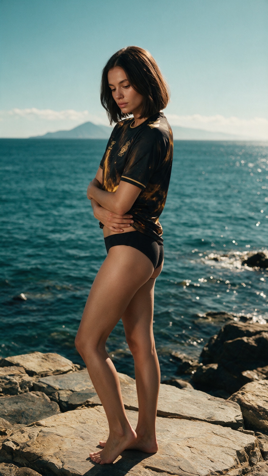
What started as a shirt design grew into a small campaign. Entre Islas became the name, but also the frame in which photography, typography, film and language came together. The shirt became the centre of a story.
Photography · Art direction · Styling · Post-production
What this shirt
means to me.
In the end, Entre Islas stands for more than this design contest. It brings together a few things I truly enjoy: football, football shirts, travelling, culture, telling stories. And above all: keeping on making.
Tenerife was our first holiday together. Gran Canaria became the place where we got engaged. A few months later, exactly those two islands inspired a shirt. I could never have imagined that beforehand.
Not everything has to be decided at the start. Sometimes you just have to begin making and see where it takes you.

Entre islas is a concept design for UD Las Palmas’ Colección 12 design contest. Not an official product of the club or of Hummel.